Flyer printing: The dos and don'ts
This entry was posted on January 16, 2014.
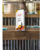
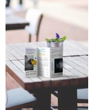
Flyer printing is an inexpensive promotional practice to spread awareness. The flyer comes in a single page and small messages, offers, images or photos that spark quick impact. Flyers are easy mediums to propagate message as they can be sent as mails or spread out through bulletin boards, hand out or spread through local newspapers or any other ways. Like various ways of promoting, task of designing and printing flyers has several varieties. Though flyer designing and printing depends largely on creativity, business and products/service to announce, some dos and don'ts must be taken under consideration in every flyer printing project –
- Do select the right paper stock – Your choice of paper is important as it lays impact on overall appearance of flyers. Thick and glossy paper works better than plain white paper counterparts. Full color paper gives an attractive background for flyers. If you stick to white base, then make sure you use colorful designs to make your flyers look lively.
- Do create concise and catchy message – Single page flyer printing consisting of concise and catchy messages helps people grasp the messages in a single swoop. Write catchy headlines that address your clients' problems, clients' expectations, product benefits etc. You must keep off from long explanations and long sentences.
- Do not use complex illustrations – Do not indulge in assuming that complex illustration or too much ornamentation imprints greater impacts. Actually it is the simple and beautiful designs that are latest trend and attract people's attention more. Great designing layout with simple illustrations and less embellishment create a focus on flyers. Limit number of images to two to three maximum, otherwise your flyer will look too congested.
- Do not forget call-to-action words – Call to action words guide or motivate readers in taking the right action which would call for a prospective lead or sale. Therefore, do not omit call to action phrases like "call right now", "Want to know", "get gorgeous faster", "grab before the stock ends" etc.
Along with these above dos and don'ts, you can also consider some other ‘must dos' like including existing clients' testimonials to supply references for your readers to build up their trust. Do not overindulge in using too many colors. Though colors make your flyers look vivid, appealing and energetic overuse of them may result in a cluttered look.


