A Few Arrows Aren't Enough For Creative Directional Signage
This entry was posted on November 7, 2016.
 If you have a major event taking place, whether it is a business conference, a trader’s fair, a festival or a sporting occasion, it pays to promote the event as best you in the lead up. Flyers and posters around the city and online marketing are a must for getting people through the door. The promotional work does not stop there, however.
Event signage means more than just a welcoming banner outside the building and a simple directional sign in the lobby. Once your guests have arrived, they need to know precisely where they are going and why they should stick around. Make sure to provide clear directions and fluid, ongoing communication – but don’t be afraid to think outside the box. Maintain contact with guests as you guide them around the facilities.
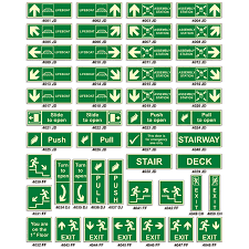
The obvious approach to directional signs at a major event is to create some simple posters with arrows to put up in a corridor or to create a detailed map in the lobby. There are two issues with this approach. Firstly, one complex map can be confusing for your guests, especially if they get to the other end of a building or campus and forget which way to go. Secondly, there could be a large empty gap between these signs. You want your guests to follow a route to your product, service or event without them having to think about the directions.
Color coded signage – blue for the catering, red for the event, green for the merchandise – makes it as simple as following the yellow brick road to Emerald city. Be creative with these directions and stay in contact. If they have to take an elevator or escalator to reach a dining area or a spectators’ platform then make use of tha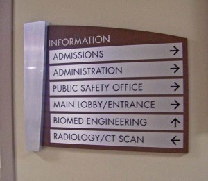 t space to reassure them they are on the way to something great. Use the right colors, but also use images of what lies ahead to increase anticipation.
This communication could be as simple as some repeated text on decals that are applied to a staircase or a bold as a large, see-through window sign on the side of a glass elevator. Be creative. Everything about your event should be memorable and say something about your brand and the product being sold. This means that creative, customized promotional material should extend past the advertisement into the directional signage. Really think about the shape, images and message of your signs and where they are placed.
If your brand has a mascot, use a large standee to literally point people in the right direction. This applies to all aspects of the event, from the bar area and entertainment to the restroom.
Have you considered what you might put beside a urinal to encourage people to continue their journey around the event? Essentially, there is no wrong way to guide a customer or attendee to an area as long as they get there with a smile on their face and make use of what has been provided. Have fun with the designs, put yourself in the mindset of someone new to the building and event and ignore the usual conventions.
