Choosing The Right Color Scheme For Your Booklet
This entry was posted on November 7, 2016.
Choosing The Right Color Scheme For Your Booklet
The best booklets are visual masterpieces that draw in potential business clients or event attendees with top-class photography, stylish logos and brilliant color schemes. The problem for many businesses, however, is choosing the best color scheme to express their message. By understanding the psychology of color and how best to apply them, you can ensure that reader immediately understand precisely what you have to offer.
Different colors have different meanings
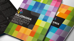
Our brains interpret colors in different ways and certain hues will evoke different memories. There are, however, a number of immediate associations that we tend to make that can have an important effect on our attitude towards the material. Greens and blues are soothing, calming colors – the former being associated with nature and the latter to everything from a tranquil spa to an inviting ocean. Red and orange tend to signal danger or a greater sense of urgency. Yellow has childlike qualities of happiness and friendship while its complimentary color, purple, is more comforting and also authoritatively regal. When to go bold and when to tone things down. A nice blend of primary colors can really make a booklet jump off the rack, but there is something child-like to some of these schemes that may not really work in some professional environments. A great example of this is with spas and other therapeutic businesses. A calming blue font, a stone or sand colored background and some other natural colors may not stand out so much, but they will look appropriate. The same principle applies if you are working in a natural environment, such as for a conservation group or a garden. Avoid the clinical white backgrounds and artificial hues and stick to more sympathetic tones that really express the ideas and location of the business.
If you are struggling to choose the precise tones and colors that will best do this, a great starting point is with the photographs that you need to include. These images tell a much better story than any font or color scheme ever could and you don’t want these images to be lost behind uncomplimentary colors that steal the focus. Say, for example, you have a ski rental store with orange gear and lots of photos of the equipment in the snow. A dark background and lot of red text isn’t going to help. 
Keep it simple and complimentary
You want to get your audiences attention with a booklet in order to make a sale, but you don’t have to smack them around the face with the ideas at the same time. Take the time to think about the most important color associated with the business, tie it in with photographs and use appropriate, complimentary tones for a pleasing background and some subtle accents.


